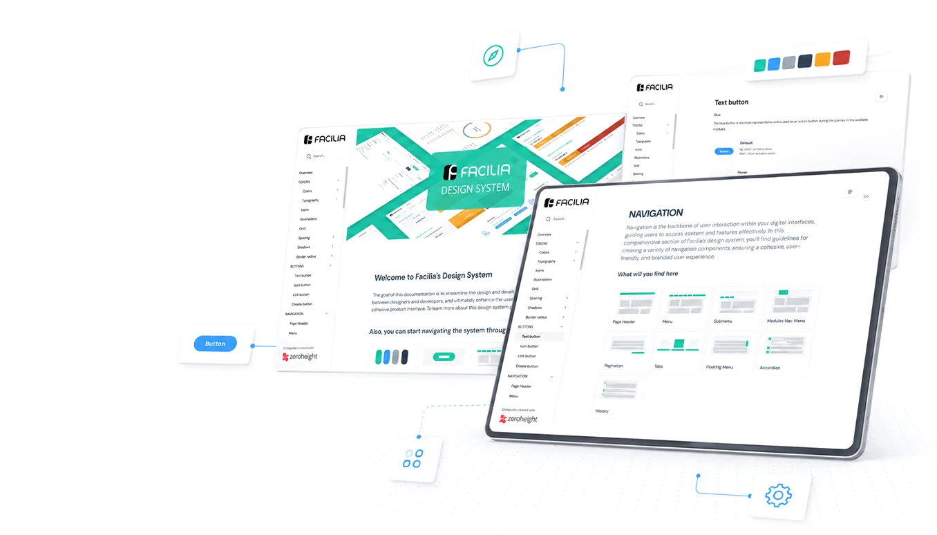
From inherited chaos to a B2B platform in production
Facilia is an invoicing and management platform for small businesses. I joined a project that had lost its designer and never had a direction, and stayed to design the product end to end, used today by tens of thousands of businesses across France.
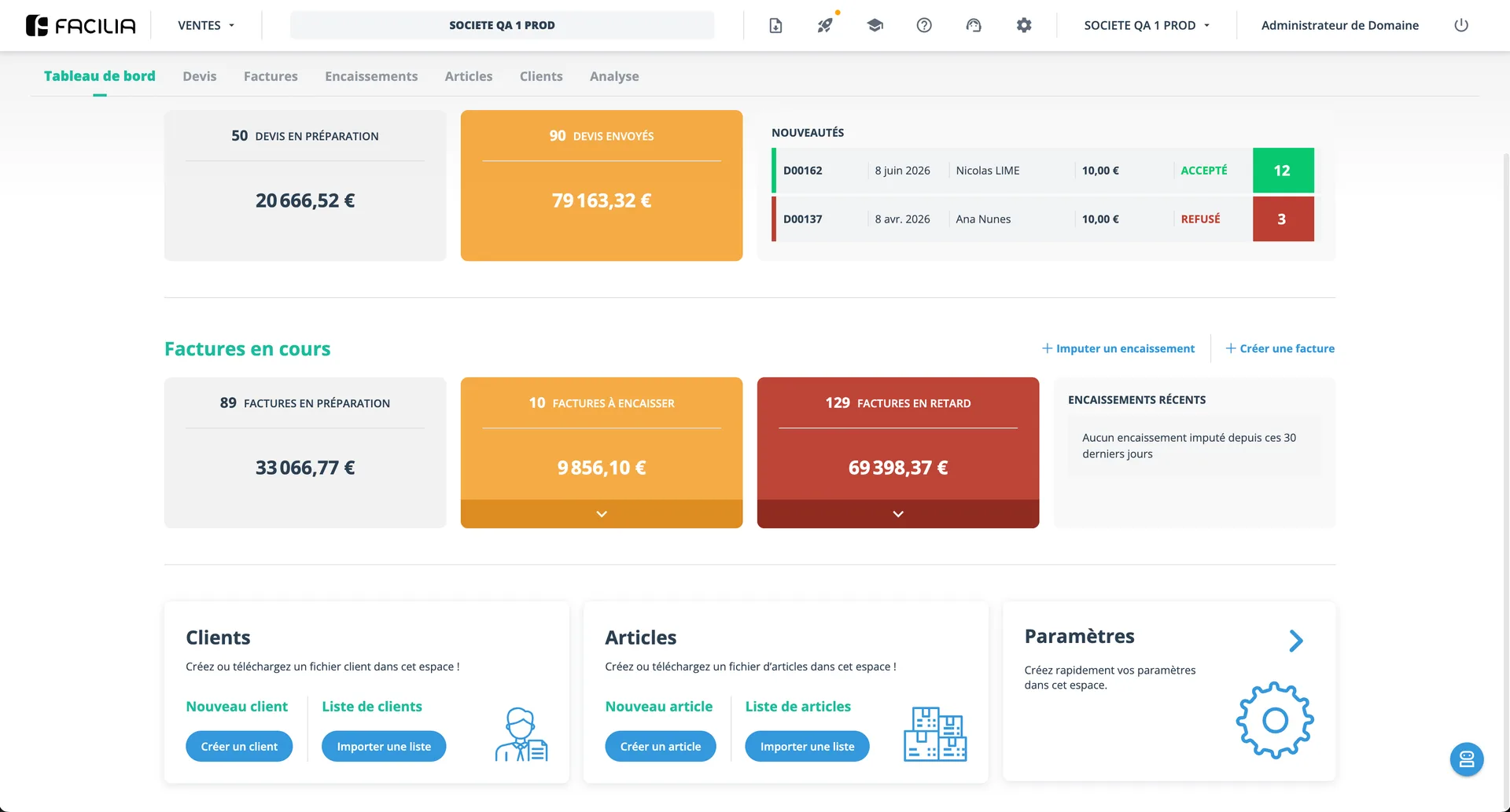
Context
Fiducial is a French multi-sector group. One of its pillars is Fiducial Comptabilité: a network of accounting offices spread across France, managing the books of local small businesses: the bakery, the medical practice, the gardening company.
Facilia was born to serve those end clients: a SaaS platform for quotes, invoices and payments, designed for small-business owners, people who master neither accounting nor software. The project's structural quirk shaped all of my work: strategy sat in France (Lyon), execution in Portugal (Braga), with requirements arriving through intermediate managers, often vague and undocumented.
What I inherited
I joined about six months after the project started, and I didn't find a beginning, I found a problem. The previous designer had left, burned out. Dozens of screens, designed but disconnected, no documentation, no defined criteria. And most critically: development was already under way, building on top of that undefined base.
The tension that defines this case: giving direction to a product without being able to stop a train already in motion.
Diagnose before designing
My first decision was to design nothing. Before producing a single screen, I needed to understand what existed and why, and the answer, after questioning the people in charge, was that there was practically no documented "why". So I started with the knowledge infrastructure that was missing.
That mapping revealed the project's most dangerous pattern: inherited features with ambition out of proportion to delivery capacity, and no usability return to justify the cost.
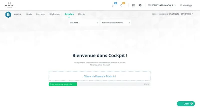
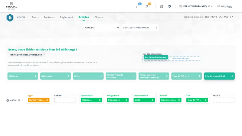
Decision 01: Simplify the import without losing the business value
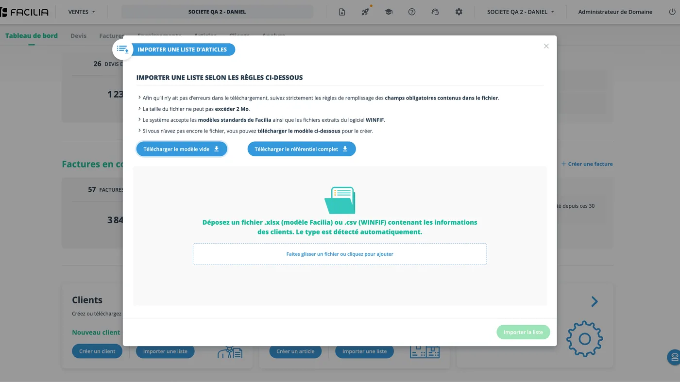
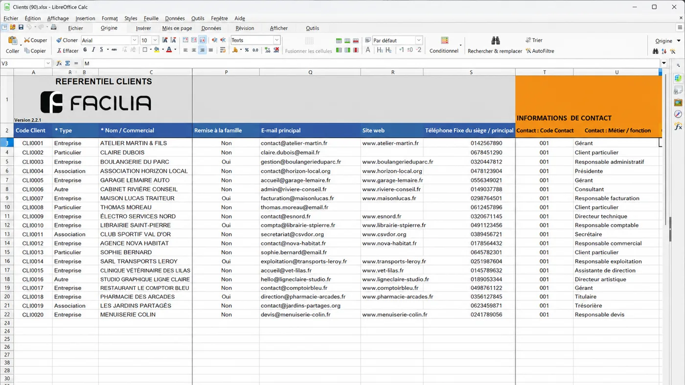
The clearest case was the data-import onboarding. The inherited flow was practically a product inside the product: the imported Excel became an editable table in the system, with multiple steps before the final import. Unbuildable within the deadline, out of proportion to the problem.
I cut the ambition, not the value.
Decision 02: A form is a form; a document is something else
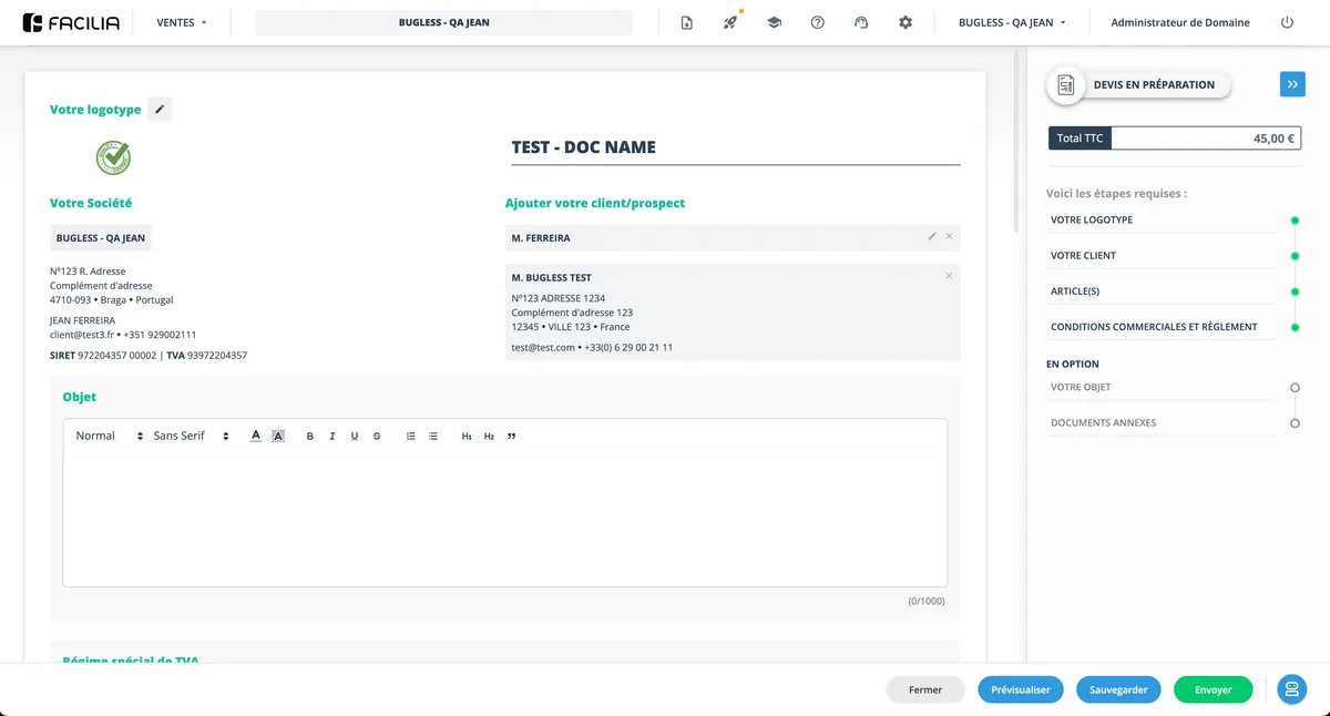
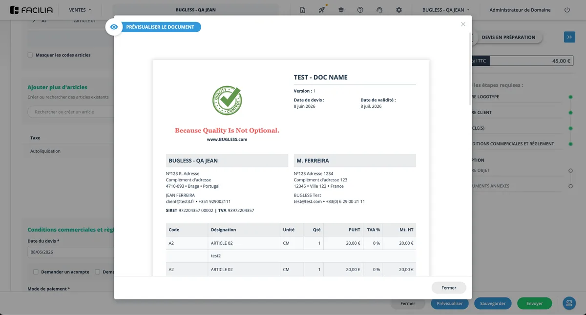
In the original concept the quote form was rendered on screen as an A4 sheet, and the PDF mirrored it exactly: a visually poor document, and an editing interface held hostage by the paper format.
Method, matured: the Achat module
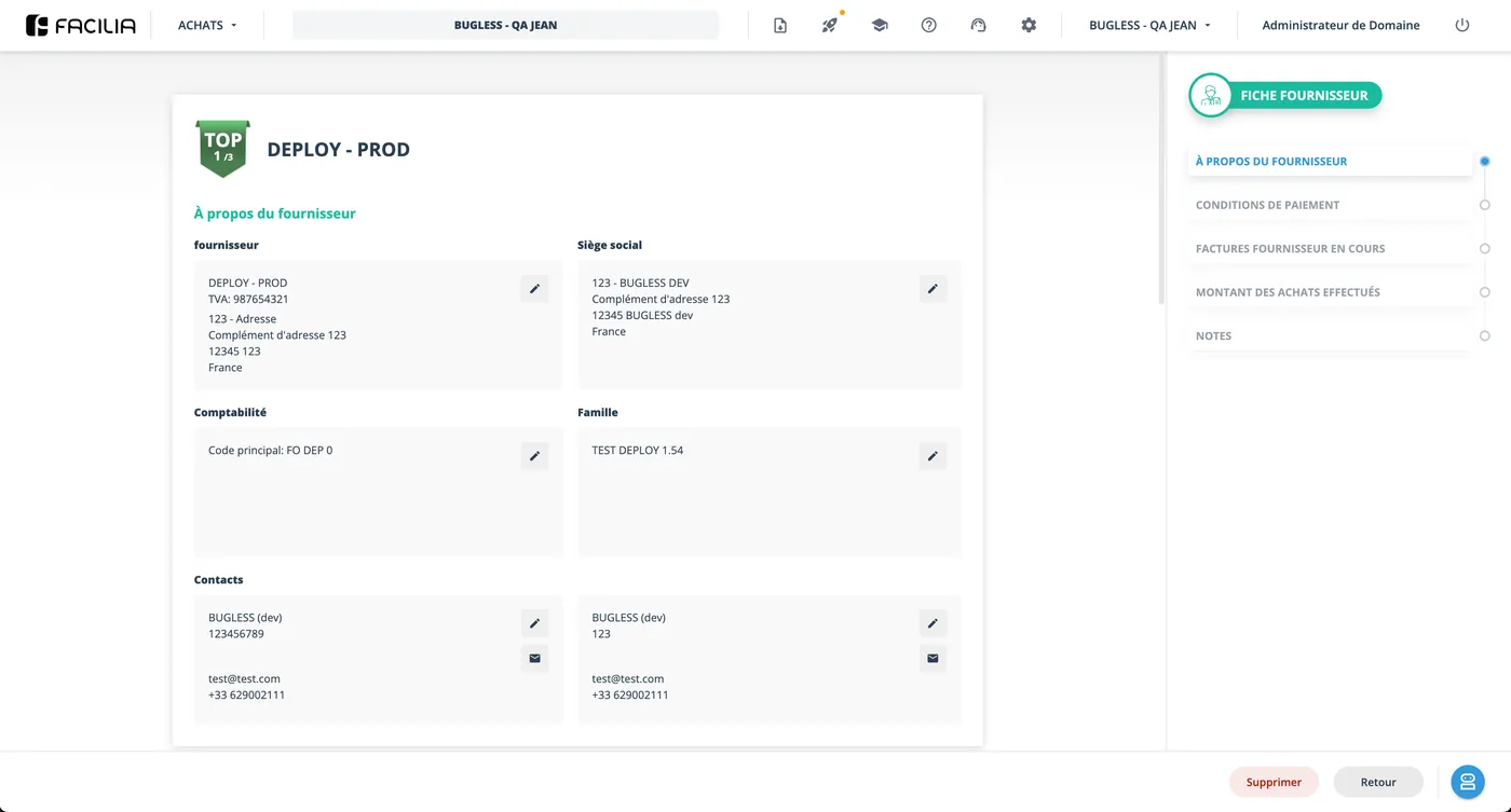
Sales was born in the chaos of the early phase. When the Purchases module (Achat) came, the process was different: I started with the map: the complete architecture designed before a single screen.
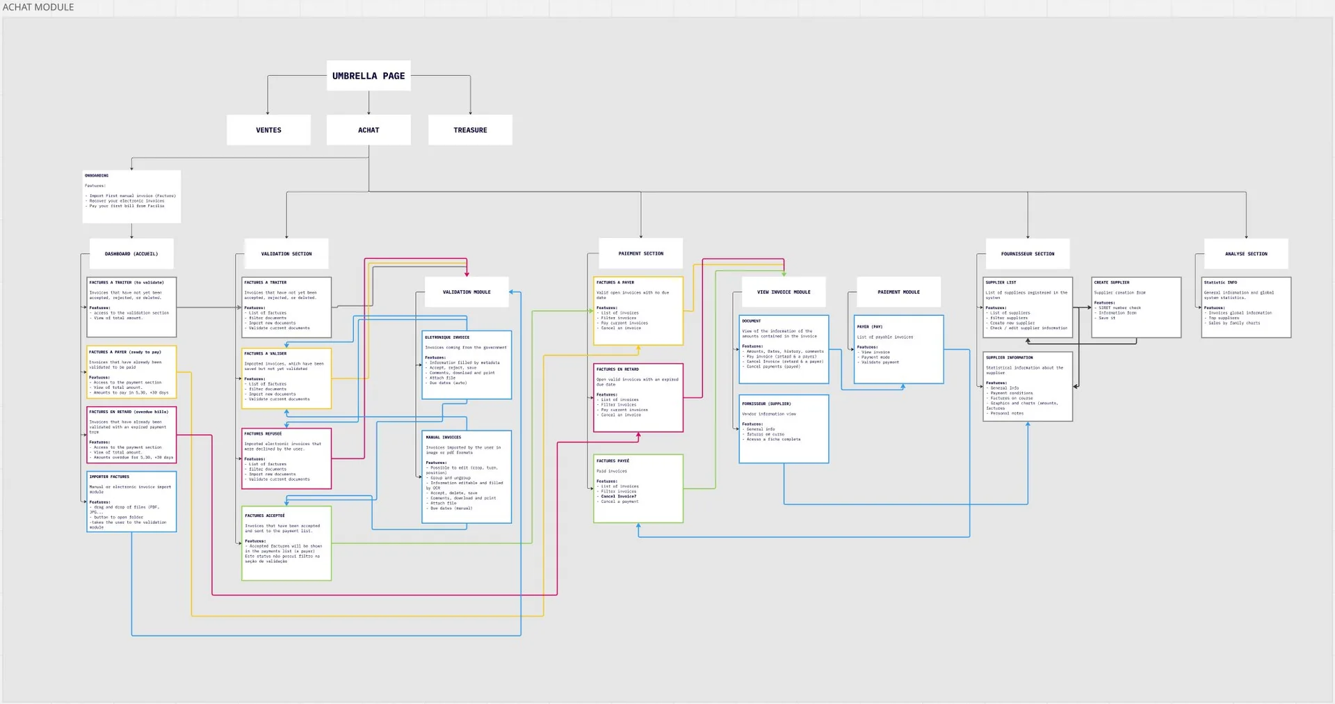
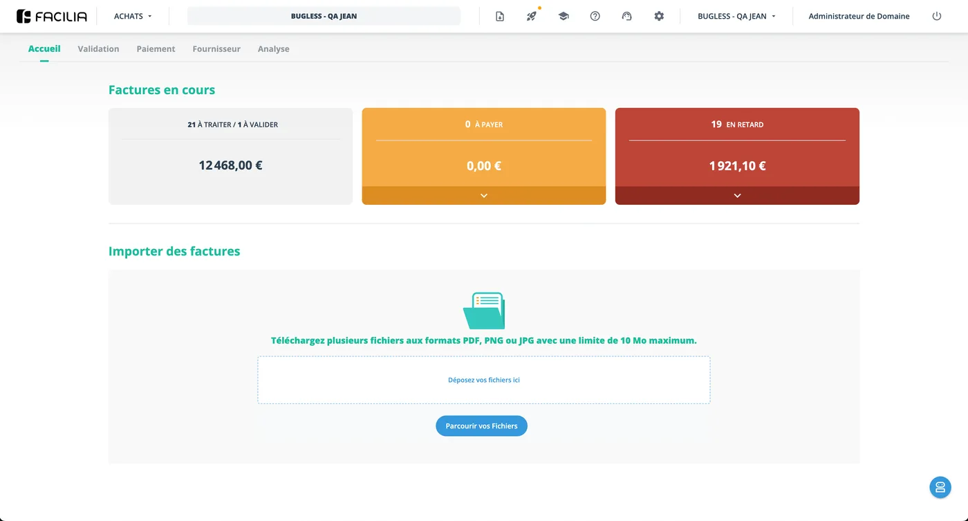
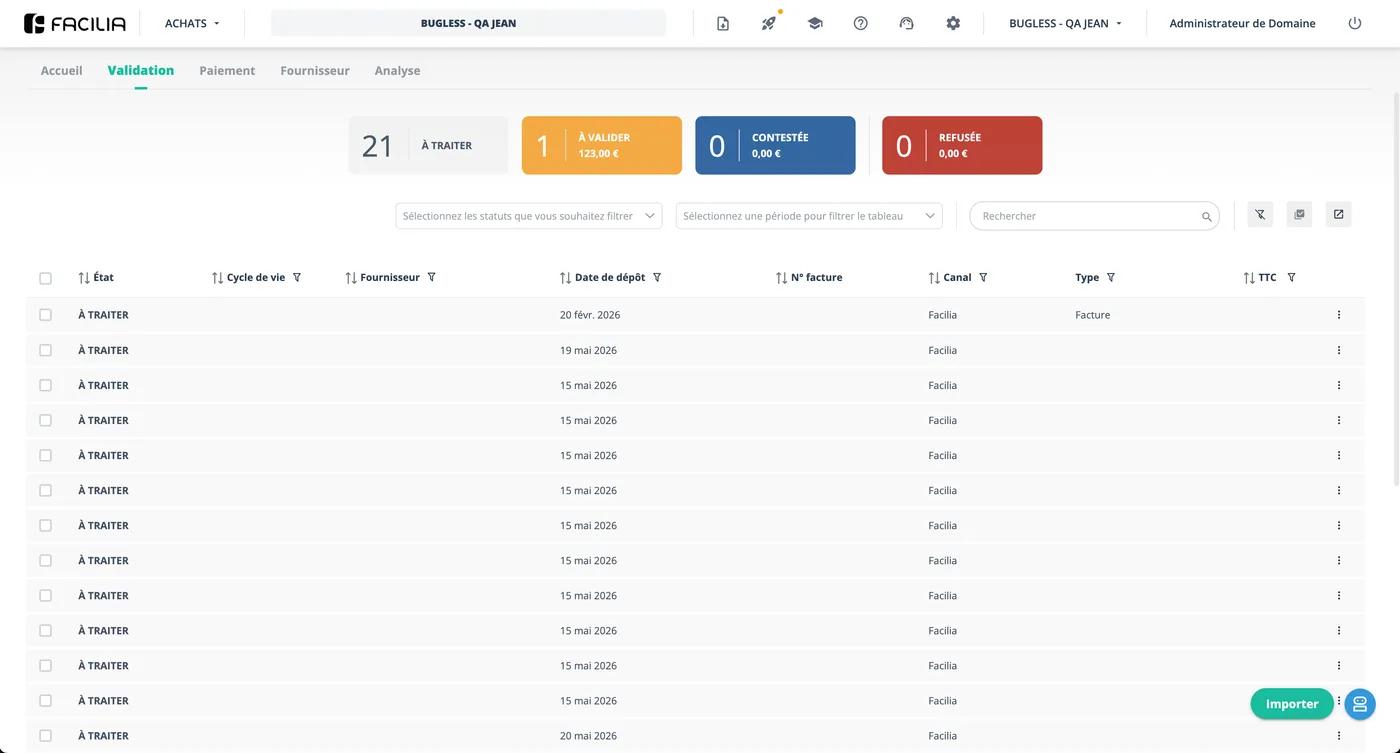
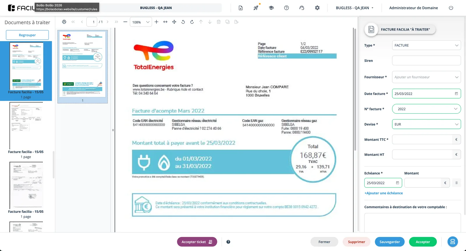
What was mapped is what was built. The blueprint corresponds, one to one, to what is in production.
Outcome
Early 2025
In production since, in continuous base expansion
~40k
Active clients in the Purchases module alone
~25k
Active clients in the Sales module
3rd module
Treasury, with bank integration, in development
Tens of thousands of active clients overall, on the way to the business goal of 100k.
Revenue model per module (Sales, Purchases, Treasury) plus document-issuing credits.
What this project taught me
That the most important design work isn't always visual. At this scale, the decisions that generated the most value were structural: creating the knowledge infrastructure that didn't exist, filtering ambition into something deliverable, separating concepts that were glued together (form/document), and building the process that lets the next feature be born mapped instead of improvised.
In a multi-country, multi-stakeholder environment under pressure, the competence that sustains all the others is judgment: knowing what to defend, what to negotiate, and what to let go.
Current frontier: I'm working to take the product to its next maturity: from adoption metrics (how many use it) to behaviour metrics (how they use it), so the next cycle of UX decisions is driven by real usage data.