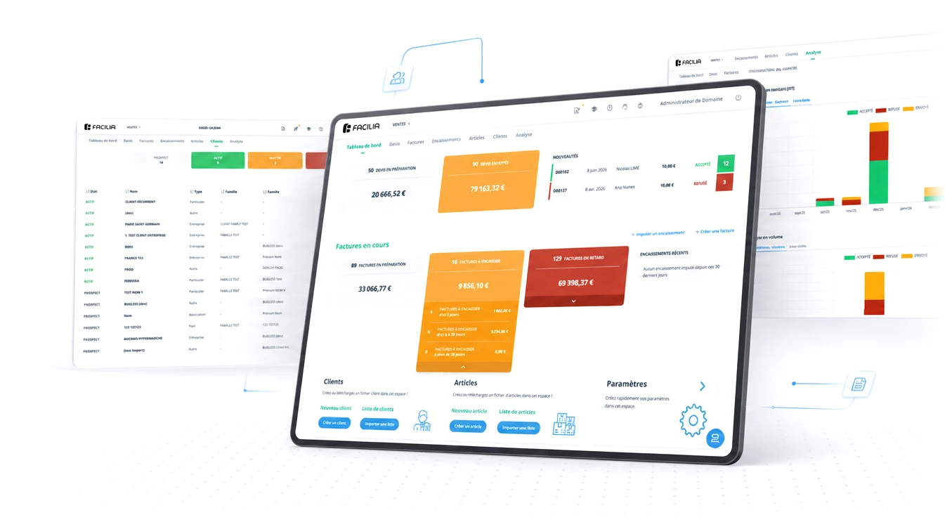
Translating a desktop platform into a mobile paradigm
How do you take a dense accounting product (tables, states, amounts) onto a phone screen without shrinking it? You rethink it. Tables become lists, rows become bottom sheets, and the phone gains one thing the desktop never had: capture on the go.
The challenge
In early 2026 Facilia opened the mobile front, and the problem was obvious from day one: an accounting system is everything a phone screen doesn't want. Wide tables, multiple states, amounts that need precision.
The easy answer: squeeze the desktop into a smaller viewport. The right one: accept that mobile is a different context, and design for it.
The working mode: influence without authority
Mobile is built by dedicated teams in France and Portugal. My role is hybrid: strategic consultancy (I'm the living memory of five years of product decisions) and the UI transposition, pattern by pattern. Leadership here is lateral: decisions travel by technical persuasion, not title.
The strategy: a second screen, not a full port
The structural decision was phasing by value. Instead of porting the whole product (and delaying everything), the app is born as a companion to the desktop: it covers what makes sense on the move and leaves to the desk what needs the desk.
Issuing invoices and executing payments stay on the desktop, already designed for the next phases.
Five products, screen by screen, before settling a single pattern
Before fixing each mobile pattern, I studied how the leading invoicing and accounting apps handle these tasks on a phone, screen by screen. The point wasn't to copy: it was to see which conventions users already carry from other apps, and where the category still gets it wrong, so the transposition could lean on the familiar and improve on the rest.




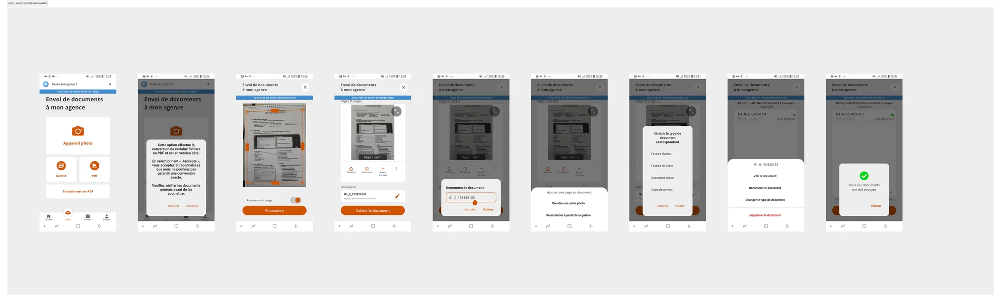
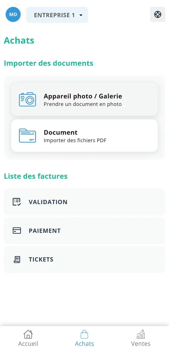
Most of the field still ports the desktop table or hides the real work behind generic forms, which is exactly what told me the list + bottom-sheet paradigm, and the capture-first home, were the right bets.
The transposition: change the paradigm, not the size
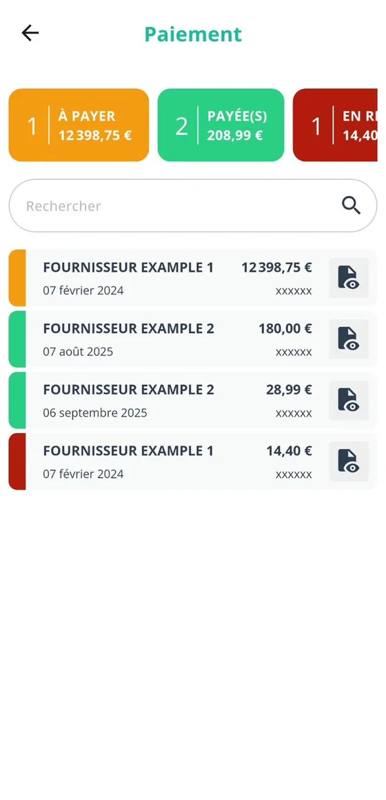
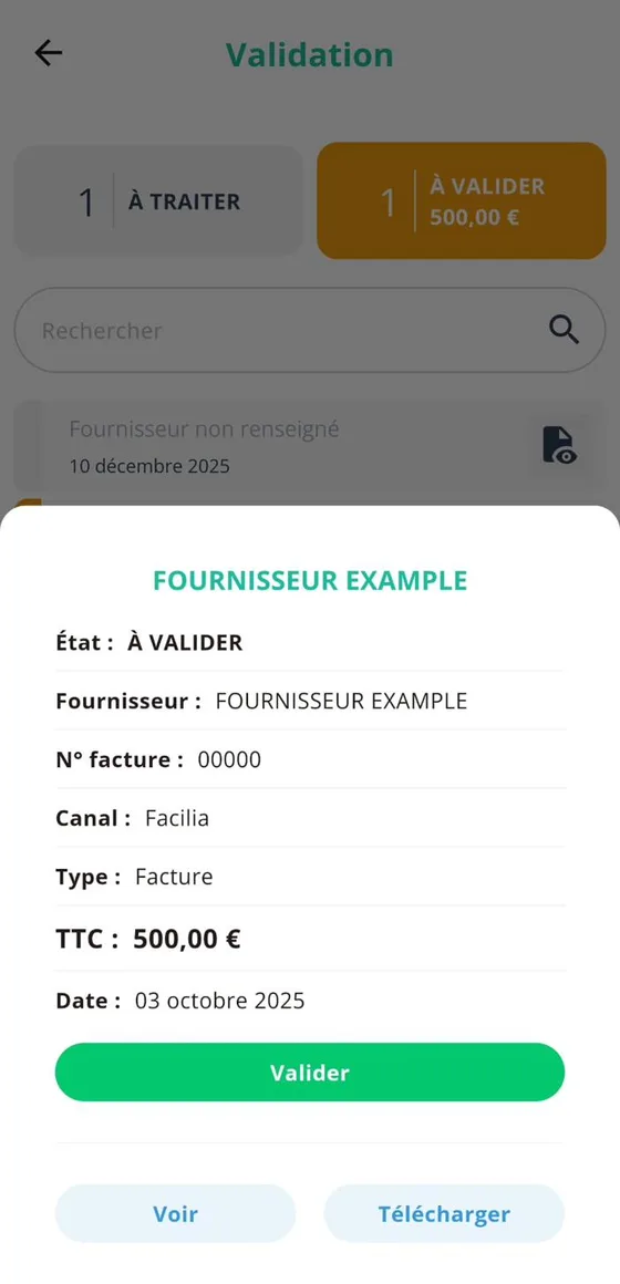
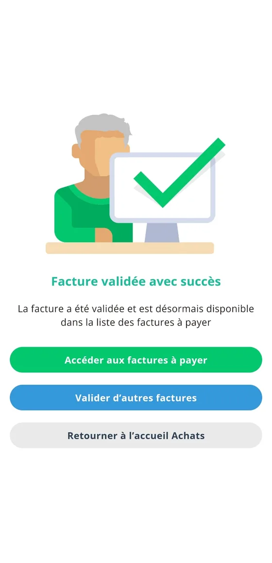
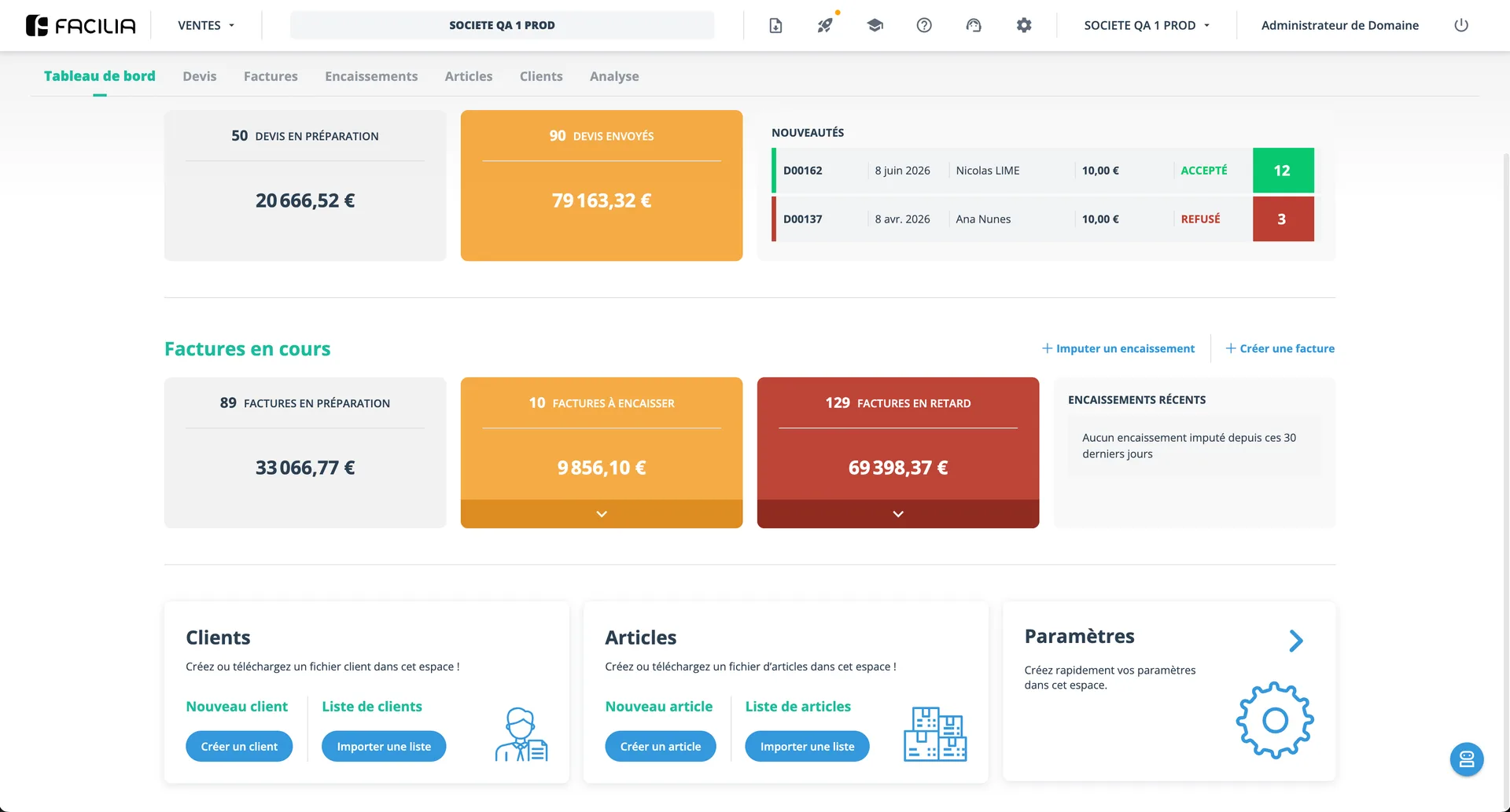
The core translation from desktop to mobile wasn't visual: it was a change of paradigm. On desktop, the heart of the interface is tables: sortable columns, filters, dozens of visible rows. On a phone, a table is a dead end. The transposition replaced the whole paradigm.
The highlight: expense capture on the move
The best proof that mobile isn't a port is the feature that doesn't exist on desktop, because it only makes sense in your pocket.
The scenario is everyday for Facilia's audience: lunch with a client, filling up the car, and that receipt needs to become an accounting document before it's lost in the wallet. The flow solves it in seconds.
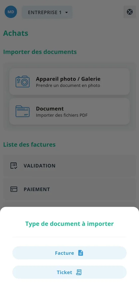

The phone stops being a smaller version of the product and becomes the fastest capture point of the whole ecosystem.
What this project taught me
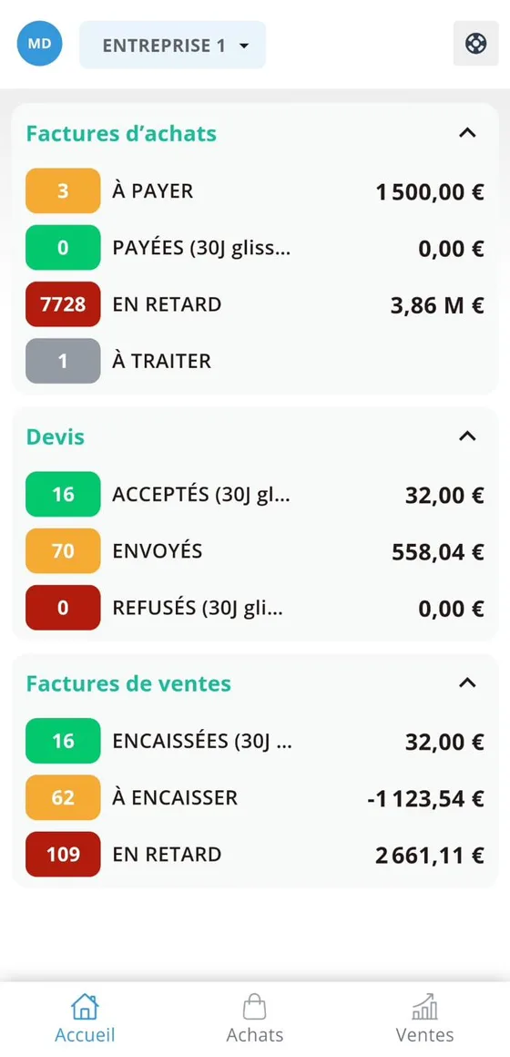
That transposition isn't reduction. The work wasn't shrinking screens. It was deciding, pattern by pattern, what the right mobile equivalent was: the table that becomes a list, the detail that becomes a bottom sheet, the dashboard that becomes an accordion.
And influencing a team that isn't yours is a competence of its own: the authority came from command of the product, not the org chart.